

Some visitors arrive with a specific intention but no settled preference. They may be deciding between doing the work internally, hiring someone for a defined intervention or seeking ongoing support. A page that speaks only to people who have already chosen the company leaves much of that comparison unanswered.
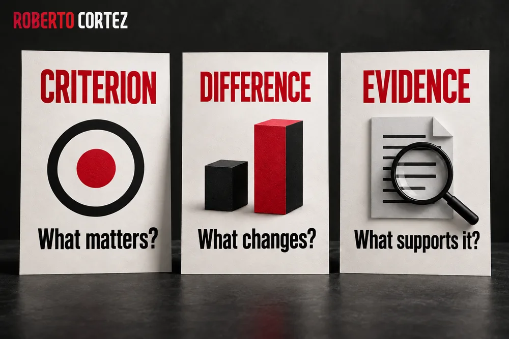
When I think about differentiating an offer, I look for what changes for the buyer and what evidence exists to show it. Calling a service comprehensive, personalised or innovative does not, by itself, clarify the choice. People need to connect a difference to their circumstances and to what they want to resolve.
I will use a fictional example: a company wants to organise follow-up for incoming sales enquiries. It is still assessing whether its current team can do that, whether it needs help structuring the process or whether it wants continuing support. A potential provider's page should explain where the proposed intervention fits, without inventing certainty about the other options.
Identify the decision the visitor is still trying to make
Write down the question the page should help resolve before choosing its arguments. Someone comparing options may be assessing the approach, the provider or the size of the commitment. Distinguish those situations, because they require different information and cannot all be resolved with more testimonials, a bigger button or a longer introduction to the company.
In the example, one person may be asking whether hiring someone is necessary or whether reorganising internal responsibilities would be enough. Another has decided to seek help but is comparing someone who designs the process with someone who also supports its implementation. A third wants to understand whether to begin with a diagnosis or proceed directly to implementation.
If you mix these questions without a clear order, the page can accumulate arguments while remaining difficult to use. Credentials address confidence in the provider, but they do not necessarily explain when hiring that type of service makes sense. A list of included tasks describes delivery but may not clarify the problem it was designed to address.
I would start with sales conversations that already exist in the business. I would look for recurring questions, options mentioned spontaneously and reasons given for delaying a decision. I would not turn an isolated question into a conclusion about the whole market; I would use those records to form hypotheses the page can help clarify.
I would also distinguish comparison from lack of interest. Someone asking about responsibilities, entry conditions or continuity may be seriously assessing fit. Responding only with urgency or pressure to make contact can leave unanswered precisely the information that would allow them to move forward.
Choose one main decision for that page and make it recognisable in the opening. For example, explain the situations in which external intervention helps organise sales follow-up. Later decisions can appear as the person reads, after they understand whether that category of help matches what they are looking for.
This preparation relates to the brief needed before asking AI to write a sales page. The distinction here is how that context organises a comparison: the page must help someone who is still choosing, rather than merely present arguments in the company's favour. Its structure should reflect that unresolved choice throughout the reading experience.
Choose criteria that change whether the offer fits
Present criteria that help visitors recognise whether the offer suits their situation. Prefer differences with observable consequences, such as scope, team involvement and planned follow-up. Explain the conditions in which each criterion matters, so people can relate the information to their own case instead of receiving a list of advantages without enough context to assess them.
In the fictional service, the degree of internal team participation may be a relevant criterion. A company with someone available to implement changes seeks different help from one needing supported execution. The page should clarify that requirement without claiming that one way of working is superior in every situation.
Scope is another criterion that often needs translation into concrete terms. “Organising the sales process” could mean mapping stages and responsibilities, configuring a tool, training the team or supporting its use. Those deliverables can be combined, but they are not equivalent and should not be hidden inside the same broad expression.
Continuity also deserves a concrete explanation. If the intervention ends with a defined deliverable, state what marks its completion. If subsequent support exists, describe only what is actually planned, without adding a frequency, duration or level of availability that the offer does not include.
Avoid selecting criteria only because your company can score well on them. A comparison centred on the number of meetings can distract from their usefulness. The visitor needs to understand which decisions are made, who participates and how that work contributes to the delivery they are considering.
To review each criterion, ask what the person would do differently after learning that information. If the answer does not change their assessment of the offer, the detail may belong in a later technical explanation. The page becomes clearer when it prioritises differences that support a decision while keeping necessary detail accessible.
You can show conditions of suitability without creating rigid labels for buyers. A team may have the capacity to perform one part of the work and need help with another. A useful explanation lets the reader recognise that combination and prepare a more precise conversation about the intervention that makes sense for their business.
Compare options using the same scope and visible limits
When presenting alternatives, use the same question and scope to describe them. Explain what is included, what depends on the buyer and what still needs confirmation. Avoid constructing a comparison where your offer receives a complete description while the others are reduced to their weakest points or to assumptions you have not actually verified.
You can support comparison without publishing a competitor table. In the example, the page can explain situations where internal execution, a defined intervention or continuing support makes sense. That allows discussion of working models without assigning prices, limitations or results to companies you do not know well enough to describe accurately.
Internal work should be presented with the resources it requires. It may need available time, decision-making capacity and someone responsible for maintaining the process. External contracting also has requirements: access to information, team collaboration and client decisions that no provider can make alone.
When comparing a one-off intervention with ongoing support, keep the difference in scope clear. An initial delivery should not seem incomplete simply because it ends, just as support should not seem unnecessary simply because it continues. Usefulness depends on the problem, internal capacity and what the business wants to keep reviewing.
A table can help when criteria are concrete and parallel. Each row should answer the same question across all columns, using sufficiently precise language for the reader to understand the difference. Cells containing only “yes” and “no” may be inadequate when the answer depends on relevant conditions.
If you lack verified information about an option, acknowledge that limit or remove it from the comparison. Do not fill the gap with a disadvantage convenient to your argument. A page that teaches people what to ask can be useful even when it cannot answer on behalf of every provider in the market.
The comparison should remain valid when a salesperson reads it together with a buyer. If the text constantly needs correction through qualifications the page omitted, the content is oversimplifying. Rewrite the explanation so that the public information and the later conversation begin from the same scope and the same understanding of the work involved.
Place evidence beside the difference you want to demonstrate
Choose evidence that supports the specific claim made in each part of the page. Evidence of experience, a sample deliverable and a testimonial answer different questions. Explain the context needed to interpret each element, and avoid using results from another offer to confirm a benefit that has not been demonstrated for this service or this situation.
If you claim that the intervention organises responsibilities, an authorised example of a responsibility map can help explain the delivery. It does not need to expose confidential information to be useful. It needs to show how work is distributed and what type of decision the document helps the team make.
A fictional demonstration can also clarify how something works, provided it is identified as fictional. It shows what a deliverable's structure could look like; it does not prove that a customer obtained a particular result. Keep that distinction close to the example so that its visual appearance does not turn an illustration into commercial evidence.
Testimonials need to match the experience they actually describe. Someone may praise an earlier training programme, which can say something about the trainer's clarity. It does not establish that they received an implementation service they never purchased, or that they achieved results the testimonial does not mention.
The same care applies to company or professional figures. Accumulated experience can provide context about the service provider, but its approved origin and scope must remain clear. Do not attribute the provider's own revenue to customer results or turn a career metric into a guarantee about the delivery being presented.
If specific evidence is still missing, improve the process explanation using what you can truthfully show. You can describe the sequence of work, the planned decisions and the materials the client needs to prepare. That transparency supports an assessment of fit without fabricating a case to fill the space reserved for evidence.
When reviewing the page, connect each important statement with the available evidence. If the evidence establishes less than the text suggests, narrow the claim. If it demonstrates something else, move it; proximity between argument and evidence should help readers assess the relationship rather than ask them to accept it through association alone.
Show the work and conditions that remain with the buyer
Explain what the person or team must provide for delivery to proceed. Include necessary information, participation and decisions without inventing requirements that are not yet part of the offer. Someone comparing options needs to assess the full commitment, because an apparently simple service may depend on internal resources the visitor has not confirmed are available.
In the example, organising sales follow-up may require understanding current stages, consulting records and involving the people who answer enquiries. The page does not need to turn that preparation into an extensive manual. It needs to make visible the conditions that could change the decision to hire or the appropriate time to start.
Distinguish what is needed at the outset from what can be prepared during the work. If everything appears as an immediate prerequisite, the offer may seem unnecessarily inaccessible. If nothing is mentioned, the person may proceed with an expectation of provider independence that the operation cannot fulfil.
It is also useful to clarify who makes decisions affecting the client's team. A provider can recommend stages, help configure tools and prepare documentation. Choosing internal owners or changing priorities may depend on someone within the company, and the proposal should make that participation understandable.
The buyer's effort belongs in the comparison between alternatives. One option may require more internal execution, while another involves more coordination with a partner. You do not need to convert all that effort into an invented number; explain tasks and responsibilities so the company can evaluate its actual availability.
Financial conditions should follow what the offer genuinely allows you to communicate. If price depends on diagnosis and scope, explain that dependency and what information is needed to establish it. Avoid presenting an entry price as if it covered every situation, or hiding relevant components to create an impression of cost that the later proposal will contradict.
This work benefits from a diagnosis before proposing a marketing plan. The page can help the visitor prepare for that diagnosis. The clearer the expected commitment, the more useful the conversation about suitability and about what remains to be confirmed can become for both parties involved.
Suggest a next step proportionate to the remaining question
Choose an action that matches the state of the decision and explain what follows it. A visitor still assessing fit may need to clarify scope before hiring. The button and form should reflect that actual commitment, allowing progress with enough context without presenting an exploratory conversation as a completed purchase or a purchase as a simple information request.
In the fictional example, a form might ask what difficulty exists in sales follow-up and which part the team can already handle. Those answers help prepare an assessment of fit. Asking for them makes sense only if someone will read and use them in the next step, rather than collecting them merely to lengthen the form.
The explanation beside the button should be concrete. If the action requests contact to clarify the intervention, say so. If an initial review or later proposal is part of the process, describe the real process without inventing response times, guaranteed access or conditions the team has not defined.
Not every question requires an immediate conversation. A clear scope explanation, a sample deliverable or an accessible answer to a common question may let the person advance their assessment independently. The page should not require contact details merely to reveal basic information that could have been presented clearly in the first place.
At the same time, avoid multiplying paths until the next step disappears. Several buttons offering similar commitments under different names can force another unnecessary comparison. Choose the main action and place supporting detail where it resolves questions, keeping that hierarchy visible to the reader.
For personal contact requests, use the appropriate internal form and retain the context the person provided. Do not require them to repeat everything through another channel to obtain a response. The journey should help the recipient understand the question the page could not resolve on its own.
The quality of this handover also depends on what happens after submission. A confirmation should explain the next step consistently with the invitation. If the person requested clarification, the team should recognise that intention before assuming a purchase decision has already been made and is ready to execute.
Review the page through understanding and enquiry quality
Assess whether visitors can explain the offer, identify relevant differences and understand the next step. Then follow the questions and enquiries reaching the team. Clicks and submissions help reveal the journey, but the review should consider opportunity suitability and persistent misunderstandings, without automatically attributing every commercial change to the page or treating activity alone as evidence of improvement.
A reading by someone uninvolved in building the page can reveal important gaps. Ask them to explain whom the intervention serves, what it includes and what work remains with the client. Notice where they hesitate or rely on assumptions instead of asking only whether they liked the copy or design.
Test reading on a phone and the ability to find information supporting each choice. A table may work on a wide screen but become difficult to compare on a small one. The presentation should preserve the relationship between criteria and alternatives regardless of the device people use for their research.
Also collect questions that continue arriving after the revision. If enquiries reveal confusion between execution and advice, return to the scope section. If the team hears from people expecting a different delivery, check the opening, examples and form explanation before concluding that sales pressure needs to increase.
Track qualified enquiries using a definition the team recognises. A contact can be well informed but not yet ready to proceed, while another can submit the form without understanding the service. Distinguishing those situations helps assess the quality of information the page is offering to prospective buyers.
This observation connects to turning leads into customers in a service business. The page prepares one part of the journey, but the sales response, offer and delivery capacity continue to influence the decision. Keep a record of changes so you can interpret observations with that wider context in mind.
If the business first needs to clarify the difference it wants to communicate, start with the guide to positioning and value proposition. Then review the page with a concrete question: can someone still comparing options understand when this offer makes sense, why and with what commitment? That provides a useful basis for deciding what to improve next.