
In Sextas Ímpares #136, I showed a process for preparing texts and references to produce AI creatives. The real work starts before you open the image generator, in the planning stage.
Why generating images without criteria doesn't solve anything
Producing dozens of images without separating the messages only multiplies visual noise. The tool executes fast, but it doesn't know by itself which pains or desires actually drive someone to decide. If you just ask for "appealing ads," you'll get the same clichés over and over.
In the lesson, I explained that deciding what to ask for takes more work than generating the images. It starts with the message, the audience, and the limits of the offer. Then you use the tool to prepare variations you can compare, keeping the decision about what goes into the campaign with you.
If you test fifty variations of the same argument with different backgrounds, you're not learning anything new about your audience. You're just burning budget and time waiting for a result that the message itself won't deliver.
Separate the angles before asking for any image
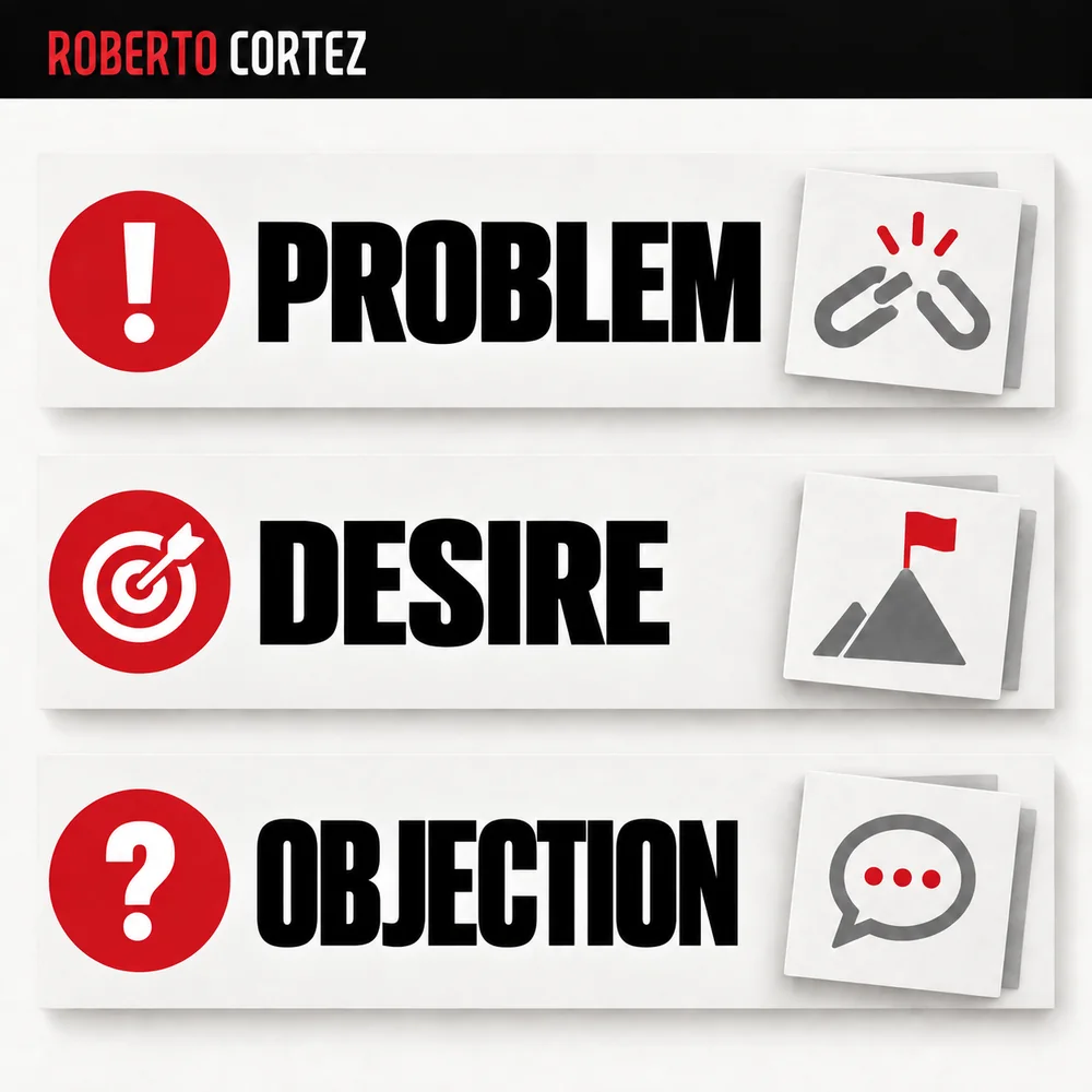
Take an offer and identify the different questions a potential customer might ask themselves. Consider the problem they want to solve, the outcome they want and what makes them hesitate. Identify the questions they need answered before they can move forward. These are distinct messages even within the same offer.
In the lesson, I used communication categories to prepare several angles: problems the persona faces, desires they have, objections that make them hesitate, beliefs they already carry, and practical benefits of the offer. You don't need to follow exactly these five, but it helps to have fixed categories instead of just writing at random.
For example, if you were promoting a training service, one ad could talk about the exhaustion of doing repetitive tasks, another about the fear of falling behind the competition, another about a stronger belief on the topic. These are three different audiences or three different states of mind within the same offer, not three cosmetic variations of the same sentence.
The advert is part of the funnel. Review the landing page and contact follow-up too.
To compare tests, prepare campaign data with clear definitions and periods.
What to Record When a Campaign or Partnership Ends
How to extract messages from your own sales page
Paste your landing page's full text into a language model and ask it to sort short hooks into your predefined categories. This prevents the AI from inventing promises your page doesn't support, keeping each ad's message aligned with what visitors actually find after clicking through.
In the lesson I used an n8n automation to extract the page text and organize it into a spreadsheet, but I also explained the simpler alternative: export the page as a PDF and send it to ChatGPT or Gemini, asking for short headlines distributed across the categories you chose. The result should never be a fake testimonial, a result you have no way to back up, or a made-up commercial condition. It's just a draft of sentences that you'll then review and filter by hand, keeping what makes sense and discarding what doesn't.
Give visual context, not just text instructions
A visual reference helps the tool understand the intended style, but it doesn't guarantee the result will come out right. In the lesson I showed how to use the offer page as a visual reference, sending screenshots of the header and isolated assets like the logo.
If you leave the generator without any reference, it will fall back on the most common visual clichés: generic blue backgrounds, neon lights, vague text. Use reference images to show the colours, typography and composition you want to keep. Even so, you have to check every single piece: does the logo stay undistorted? Is the text legible? Is the spelling correct? Does the relationship between image and message make sense, or is the image distracting from the headline?
When the offer uses real photos of people or an event, preserve that context. An illustration can portray a concept, but it shouldn't pass itself off as proof of a result, nor as an image of something that never happened.
Vary the visual format without losing the message
Once you have the visual pattern defined, you can generate variations keeping the same text to test whether what failed in an ad was the argument or just the aesthetic. This matters because if you change everything at once, you won't know what caused the difference in results.
A practical approach is to alternate between cleaner, more neutral backgrounds, conceptual mockups that suggest a working method, and images with real people in the context of the offer, when they exist. If you need vertical formats for Stories, ask for the proportion to be reformatted; in the lesson I also showed tools that let you turn a static image into a short video of a few seconds, keeping the text the same and only animating the background.
Keep track of what you're testing and don't mix variables
Identify the message behind each creative and keep that information when you put it into a campaign, so you can later relate the results back to the argument used. If you change text, image, audience, and destination page all at the same time, you won't be able to interpret what worked and what didn't.
If you want to test which communication hook works best, keep the image and the audience constant and vary only the headlines. If you want to know which graphic format performs better, keep the same hook and test different backgrounds. Once you have enough data from a comparison, review the set: which pieces were useful, which confused the offer, and which questions went unanswered? That learning is what should guide the next batch of creatives, not volume by itself.
If you want to apply this process with support, check out my AI and online business training.
How to log differences between variations so you actually learn from testing
Logging differences between variations means writing down, before you launch the ads, what the core message of each piece is. Without that, when results come in, you won't know whether it was the image, the copy, or the argument that made the difference. A simple file with this information already solves the problem.
Imagine, hypothetically, a language school testing three creatives for the same online course. The first talks about the teaching method, the second shows the support students get from teachers, the third clarifies the English level needed to start. Before uploading any image, someone writes on a sheet: creative A is about method, creative B is about support, creative C is about requirements. This label follows the creative from production through to final analysis.
The first practical step is to assign a name or code to each variation that describes the idea, not the visual look. Calling something "blue ad" or "ad with the team photo" doesn't help you interpret results later. Calling it "price_argument" or "social_proof_argument" already tells you what you're testing, even if you swap the colour or image later on.
The second step is deciding, before launch, what you're actually going to compare. If you're testing three different messages, keep the audience and format the same across them. If you're testing two audiences, keep the message the same. Mixing both at once forces you to guess afterward what actually caused the result.
In the hypothetical language school example, if creative B performs better, you need to confirm whether it really was the message about support that worked, or whether it just coincided with a more receptive audience that day. A simple way to check is to let the test run long enough to gather a minimum number of results before drawing conclusions. Deciding this at the start, not halfway through, stops you from stopping a test too early just because one number looks good.
The third step is to store the metrics alongside the message label, not just the image file name. A simple table with a "message tested" column, a "result" column, and a "notes" column is enough for most cases. You don't need a complex tool, you need the discipline to fill this in every time you launch or review a campaign.
After running the test, the analysis should answer concrete questions: which message generated more interest, which generated confused questions, which got no reaction at all. In the language school example, if creative C about requirements generates a lot of questions like "so is this course for me or not?", that's a sign the message was unclear, not necessarily that the argument itself is weak.
A common mistake is comparing results from tests run in different weeks, with different budgets, or on audiences that already saw previous ads. This contaminates the comparison and leads to wrong conclusions about which message works best. Whenever possible, run the variations you want to compare at the same time and under the same conditions.
At the end of each batch of tests, it's worth writing a short summary of what you learned, even if it's just two or three sentences. That summary is what will save you time on the next batch, because you'll already know which arguments not to test again and which questions from potential customers still haven't been answered by any creative.