
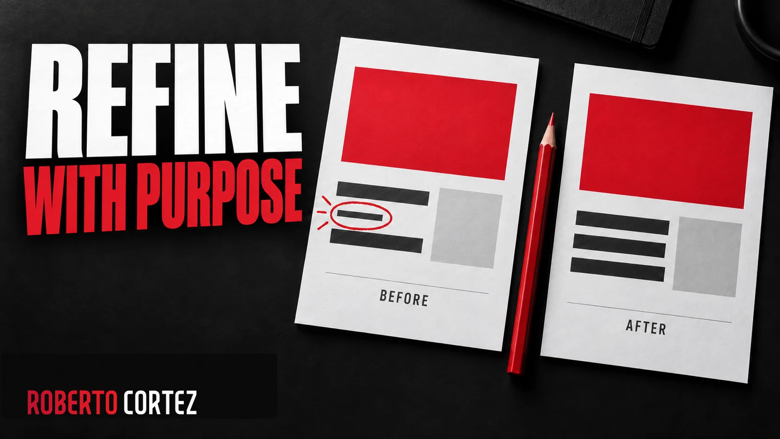
When an image works well, it is tempting to request many similar ones immediately. The request may seem clear to whoever chose the reference, but leaves unexplained what made that composition successful. Colour, typography, spacing, photography and the relationship between elements do not all perform the same role in a design.
In my work, I have been keeping references and feedback within the project itself. This helps guide subsequent creations and compare results against decisions already made. The aim is a more consistent process and more specific review, while leaving room to adapt the composition to the message of each individual image.
Explain what the reference should teach
A visual reference is more useful when accompanied by the reason it was selected. Identify the characteristics you want to preserve, such as contrast, typography, framing or text density. Distinguish them from incidental details so AI does not treat every feature of that image as a compulsory rule for the entire series.
If you liked the way a headline fills the space, say so. If the value lies in the relationship between a real photograph and a short message, record that relationship. Simply asking for similar images may lead to repetition of an object, pose or composition that does not suit the next subject.
I would also state what the reference does not authorise. An image may help explain contrast while containing a colour outside the brand palette. Another may show a photograph that should not be reused. The selection needs to communicate criteria without turning a reference into permission to copy every element it contains.
This preparation is an application of giving AI context with judgement. A few clearly explained references may guide better than a large folder of conflicting styles. When several visual families exist, identify the brand, format or objective each belongs to before production begins across the collection.
To prepare your next step, explore Personal branding for business owners.
Separate identity from elements that may vary
The series needs clear rules for identity elements and defined freedom to develop each message. Record colours, fonts, logos and authorised treatments alongside the aspects that may change. This separation allows variety without losing recognition or forcing every subject into the same composition regardless of what the particular message needs.
A photograph, object or different headline arrangement may help explain the idea. Changing a brand name, altering its logo or introducing another visual identity changes what the piece represents. I would treat those elements as reference materials to preserve, rather than as parts that can be freely reinterpreted during image generation.
In projects involving several brands, identifying the brand belongs in each piece's brief. A personal brand preference does not automatically apply to an event with its own identity. I would also avoid translating an official name or the lettering of a logo merely because the surrounding message is being adapted into another language.
Variety should come from the content and the visual solution chosen to explain it. The same principle helps create advertising variations without repeating one idea: changing a colour does not replace a different hypothesis. Equally, a new hypothesis does not require abandoning the elements that identify the brand to its audience.
Validate a sample before multiplying production
Before producing a large series, choose representative messages and check whether the rules work across different content. Include a short headline, a more demanding one and visual situations relevant to the project. The sample should expose application difficulties so you can adjust the criteria before repeating them across many more images.
As a hypothetical example, imagine a series about management decisions. A piece containing two words may look excellent while another with a longer idea becomes hard to read. Asking everything to follow the same style does not resolve that problem. The message may need shortening or an alternative composition within the same identity.
I would examine the image at its viewing size as well as in a large version. I would check contrast, margins and the order in which elements attract attention. A sentence can be correct yet difficult to read on a phone; an object can be well drawn while competing with the part that should explain the message.
This stage benefits from criteria set before production, much like planning an application before building it. Specifying what counts as acceptable makes review more useful. Approving a sample validates that solution under the conditions tested, but does not remove the need to examine the images that are produced afterwards.
Give feedback with a location, reason and scope
A change request should identify the element to correct, the reason and the pieces to which the decision applies. Separate a correction for that image from a preference for future work. Saving this distinction prevents one observation from becoming a global rule or permission to remake the entire collection without a defined scope.
Instead of saying an image is confusing, I would identify the conflict: the headline competes with the photograph, or secondary information takes up too much space. Then I would explain the intended result. This makes the next version easier to assess because the criterion is connected to a difficulty that can be observed.
In my process, I requested ways to leave feedback directly on each image and preserve previous versions. That connects the note with the specific piece assessed. A typography preference can be recorded without meaning approval of all the content, every colour or the use of that piece in a future publication.
I would also review how the request was understood before extending the correction to other images. If a note says a brand has its own identity, that rule guides future work for the brand. Remaking existing files is a separate action whose scope needs defining, especially when pieces are already approved or prepared for use.
Review every piece and then the complete collection
Final validation needs to check the text, identity, visual relevance and quality of each file, followed by a comparison of the collection. Look for style deviations, unnecessary repetition and differences in treatment between languages. The process becomes stronger when corrections return to the instructions and approved versions are identified clearly for future use.
I would begin with the message: is it written correctly and does it match the accompanying content? Then I would check the logo, colours and visual materials. When photographs of people are involved, I would preserve originals and compare their use against the reference; consistency does not justify reconstructing a face or inventing an event.
For translations, I would check meaning and the space occupied by the text. A longer expression may require different line breaks without reducing readability or changing the promise. The image should still work as a composition in its target language, rather than simply receiving new words inside space designed only for the original version.
Finally, I would place the images side by side and record accepted exceptions and outstanding corrections. A series can remain recognisable while containing variety, provided the differences serve a purpose. The pattern improves when each review leaves a concrete lesson for the project, without making quality depend on repeating exactly the same request every time.