
Map the journey your store actually offers
Start by identifying the store's existing steps, including alternatives such as quick purchase, direct entry to a product or returning to a saved cart. Do not assume everyone passes through the homepage or follows the same route. The review should represent the actual journey before looking for ways to simplify it.
Note what the person does and what the store returns at each moment. Choosing a variant should update relevant information; adding to the cart should produce recognisable confirmation. People need to understand whether their action was accepted and how to continue without repeating the same gesture.
In a hypothetical example, a homeware store allows purchases from a product page and from a favourites list. If testing always begins at the homepage, it may miss a fault that only appears through the second entry. The starting point is part of the case being tested.
The logic of following stages in a sales funnel helps organise observation, although a store's journey has its own actions. Define transitions without confusing a contact, an intention and a purchase. A product placed in a cart does not yet demonstrate a completed transaction.
To prepare your next step, explore Growing an online store.
Look for information that changes too late
Friction can arise when buyers discover an important condition only after investing time in the journey. Check when availability, total cost and delivery conditions become visible. Information should accompany the decision, with a clear explanation whenever it depends on details that can only be supplied later in the buying process.
Observe what happens when quantity changes or another delivery option is selected. The total should update understandably without leaving old figures in different areas of the screen. If an advertised benefit has conditions, people need to know whether they meet them before relying on it.
In the hypothetical example, collection might be available only for certain items. That should become clear when buyers choose how to receive their order. Discovering the restriction after completing every detail creates a return to earlier steps that could have been avoided.
Record the discrepancy precisely: the initial message, the action performed and the later information. “Checkout is confusing” is an impression with little value for fixing it. “The option is selectable but rejected only at the final step” describes a situation somebody else can reproduce and assess.
Question every field and interruption
Each request for information should have a clear purpose in the purchase process or the operation that follows. Identify mandatory fields, repetition and interruptions that do not help complete the order. Distinguish what is necessary from what could be requested later, without removing controls essential to the store's actual operation.
Creating an account can be useful for certain models, but it should not become a requirement without considering the context. Check whether the store can allow purchase without that step and what consequences follow. The criterion is actual need rather than an internal preference for collecting more registrations.
Check whether people must re-enter information already supplied. An address may have particular details requiring confirmation; that differs from repeating every field because information was lost between screens. Identify the cause before simply deciding to remove stages from the journey.
Pop-ups, additional offers and invitations to subscribe to communications also consume attention. Observe whether they cover the continue button, make reading difficult or cause people to lose their place. An additional commercial action needs to justify the interruption it introduces during the purchase.
Test errors, going back and payment selection
A useful review includes situations where buyers need to correct information or return to the previous step. Check whether messages explain what to do and whether completed work is preserved. Also test the transition to payment and the return from it, within an environment prepared for carrying out that validation.
A rejected field should make it clear what is wrong and how to correct it. If people receive only a generic message at the top of a long page, they may not find the relevant field. Record where the message appears, the available action and what happens after correction.
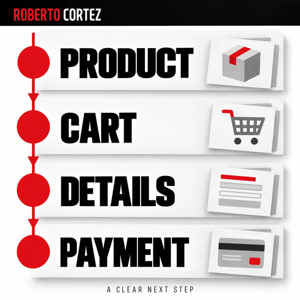
Use the test modes provided for payment methods and keep testing separate from commercial orders. Do not conclude that payment works merely because its logo appears. The behaviour and confirmation appropriate to the scenario need to be checked without accidentally creating real purchases during the review.
Consider an interruption or a payment that remains pending too. Buyers should be able to distinguish an order received from a confirmed payment, according to how the store actually operates. Contradictory messages can lead people to repeat an attempt or request support unnecessarily.
Observe use and record what happened
Test the journey on relevant devices and in relevant situations, giving the person a concrete task and observing where they hesitate or stop progressing. Record actions and outcomes before interpreting motives. An observation demonstrates a difficulty in that context and needs other evidence before it can represent all buyers.
In the hypothetical example, ask someone to choose an item and find their preferred delivery option. Avoid explaining where every button is beforehand, because that removes the uncertainty you want to observe. If you need to intervene to continue the test, record the help you gave.
The diagnosis before defining a marketing plan benefits from this combination of journey, questions and evidence. A campaign may attract suitable people while the store fails at the next transition. An expectation created by the ad may also exist that checkout merely makes visible.
Keep only the material needed to analyse the fault and avoid exposing personal or payment information in records. Describe the product, variant, device and sequence of actions sufficiently to reproduce the behaviour. The team needs a verifiable case to fix and then test again.
Fix blockages and follow the route again
Prioritise problems according to their consequences for purchase, observed reach and confidence in the evidence. A reproducible blockage deserves attention before an aesthetic preference without demonstrated effect. After fixing it, repeat the case and check subsequent steps to ensure the change has not created another interruption elsewhere in the journey.
If a valid variant cannot be added to the cart, you have a concrete fault. If the hypothesis is that earlier information will reduce hesitation, define what you will observe to assess it. Do not combine both kinds of work in a list without stating the difference in certainty.
Connect the review with indicators that help assess business progress. Fewer steps or more clicks are insufficient conclusions. What matters is whether purchases can be completed, orders arrive correctly and the experience matches the offer that was presented to the buyer.
I would finish the review with a short list of faults fixed, hypotheses awaiting tests and limitations still known. The store improves when those distinctions guide the next work. You can then discuss the journey based on what happened instead of asking vaguely for a simpler checkout.